|
|
Post by rickl on Mar 16, 2012 12:59:21 GMT -6
So far this order covers everyone that expressed an interest, plus a few extras. I would be happy to give the artwork to a board member and walk through the process I followed, or a couple paychecks down the road I can do another order for some extras (with the name of the club spelled out this time). With the groupon deal, I did this order for about $50 out of pocket. The first 4 shirts will cover that, with any extra $$ and/or left-over shirts going to the club.
-Rick
|
|
|
|
Post by ree123 on Mar 17, 2012 0:28:25 GMT -6
How many more folks are wanting to purchase them ?
|
|
|
|
Post by Jess Puff on Mar 17, 2012 11:51:39 GMT -6
My mom and dad were wanting one but my mom needs a 3X and my dad a large.
|
|
|
|
Post by rickl on Mar 17, 2012 21:27:29 GMT -6
I'll put you down for dibs on the spare large, but they don't come in 3x (which makes it kind of ironic... I'm making t-shirts, but I can't wear one myself)
|
|
|
|
Post by ree123 on Mar 17, 2012 21:39:37 GMT -6
Jess, if your mom can use my 2xl I have coming, I will relinquish it to her and wait on the next go round. Ask her and let me know. Either way is fine by me.
|
|
|
|
Post by Jess Puff on Mar 18, 2012 8:30:14 GMT -6
I don't think she would be able to do that... she told me a 3X but a 4 would be better... so idk. Maybe I'll take the graphics and find a place that will do that size. Thanks though  |
|
|
|
Post by rickl on Mar 23, 2012 11:31:19 GMT -6
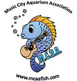
aight, so the shirts are sposed to be delivered today, this has me thinking about MCAA T-Shirt Rev. 2. I'd like to get both the spelled out club name, and the website address on it. Immediately 2 options pop to mind -- club name on front with small logo, website name on back. or -- vice versa! And of course option 3, both on back. I'm not sure both on front would work out very well, but I suppose we can call that option 4  Any thoughts? -Rick (the armchair aquarist) |
|
|
|
Post by Jess Puff on Mar 23, 2012 11:46:34 GMT -6
I'm envisioning maybe on the front have MCAA with our logo then on the back an enlarged logo with Music City Aquarium Association above the logo and the website below the logo... what about that?
|
|
|
|
Post by rickl on Mar 23, 2012 12:27:27 GMT -6
That's about how I had envisioned option 3  . Maybe if I got fancy and figured a way to curve the name on top that'd be cool, dunno if I have the mad skillz required to do that though. -Rick (the armchair aquarist) |
|
|
|
Post by bnoel210 on Mar 23, 2012 12:31:01 GMT -6
Ask Fuzzy.
|
|
|
|
Post by ree123 on Mar 23, 2012 13:03:09 GMT -6
I like Jess's suggestion above for wording and placement, but you decide.
I'm sure they'll all look great !
I had already had a few made last year, but mine all have the origional black and white version of the logo on them.
I had the club name, website, and logo varied in size and color on several different shirts.
All my origional shirts were white too. Colored shirts might look good too, after you find out how many will be willing to participate with this.
The colored logo is going to look sooooo much better !
|
|
|
|
Post by rickl on Mar 23, 2012 22:22:45 GMT -6
The shirts are here! I'll get my children to model one tomorrow and snap a picture. The printer I used had white, grey, or black shirts -- anything but white costs extra though (so white it is!). I think the logo looks pretty snazzy on a black background though, so I might have to make a few black ones next time.
-Rick
|
|
|
|
Post by ree123 on Mar 24, 2012 15:39:38 GMT -6
Don't forget the models. We wanna see.  |
|
|
|
Post by rickl on Mar 30, 2012 13:14:17 GMT -6
I'm a slacker and haven't photo'd the rev 1 shirts, but wanted to run MCAA t-shirt version 2.0 past you guys, and get feedback/suggestions to the design.  So... what do you think of the curved letters? Curve the top but flatten the web address? Flatten both? Leave both curved? What about the size? Grow the letters relative to the fish? -Rick (the armchair aquarist) <edit> changed to a clickable thumbnail... that image was big!</edit> |
|
|
|
Post by Jess Puff on Mar 30, 2012 18:01:17 GMT -6
That is exactly what I had pictured in my head! Maybe play with the size of lettering a lil bit
|
|